
Understanding Color Psychology in Label Design: How to Influence Consumer Behavior
4th Aug 2025
Color plays a significant role in how we perceive the world around us, from the clothes we wear to the food we eat. In the context of product packaging and label design, color is not just a visual element but a powerful psychological tool that can influence consumer behavior. Research shows that people make subconscious judgments about products within milliseconds of seeing them, and color plays a large part in these decisions.
Whether it’s a vibrant red that signals excitement or a calming blue that evokes trust, each color carries its own meaning and emotional impact. As a business, understanding these color associations can help you design labels that not only capture attention but also create the desired emotional response, boosting brand identity and driving sales.
In this blog, we will explore the psychological effects of color in label design, explain how different colors influence consumer trust and purchase decisions, and offer tips on how to use color to your advantage when designing labels. By the end of this guide, you'll have the knowledge to create labels that resonate with your target audience and enhance your product's appeal.
Understanding the Psychology Behind Color Choices
Color psychology is the study of how colors impact human emotions, perceptions, and behaviors. In label design, choosing the right colors can significantly affect consumer reactions, creating an emotional connection with the product before they even read the text on the label. Understanding the psychological meanings behind colors helps businesses choose hues that resonate with their target audience.
Red: Energy and Excitement
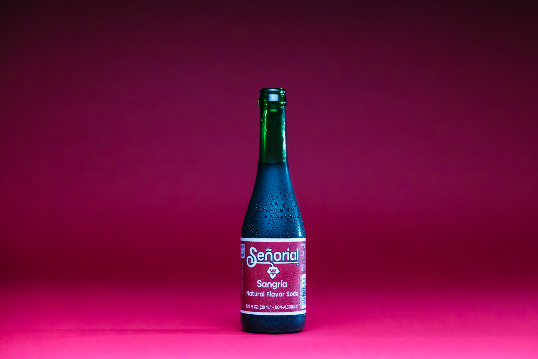
Red is one of the most attention-grabbing colors, often associated with passion, urgency, and excitement. It’s a powerful color that can evoke strong emotions, such as love, anger, or even hunger, which is why it’s commonly used in the food and beverage industry. Think about the red of Coca-Cola or the spicy red of hot sauce labels. For businesses, red can stimulate action, making it ideal for promotions, clearance sales, or impulse buys.
However, because red is such a dominant color, it should be used sparingly to avoid overwhelming the design. Pairing red with neutral tones or using it for specific accents like call-to-action buttons can create a balanced yet striking label design.
Blue: Trust and Calmness
Blue is one of the most universally liked colors, often representing trust, dependability, and calmness. This color is especially powerful in industries where credibility and reliability are essential, such as healthcare, finance, and technology. Brands like Facebook, Twitter, and IBM have long used blue to convey a sense of security and professionalism.
In label design, blue works well for products aimed at creating a sense of peace, cleanliness, or stability. It can also be paired with other colors like white or gray for a sleek, modern look. For instance, a blue label for a skincare product can suggest purity and soothing qualities, which may encourage consumer trust in the product’s effectiveness.
Yellow: Optimism and Happiness
Yellow is the color of optimism, energy, and happiness. It is often associated with positivity and attention-grabbing visuals. Brands use yellow to evoke feelings of cheerfulness and to make their products stand out on shelves. This color is commonly seen in food, toys, and even household products.
While yellow is energetic and vibrant, too much of it can overwhelm the senses. To avoid this, it’s best used as an accent color or combined with other tones to balance its intensity. Think of the bright yellow of McDonald’s packaging that is designed to attract attention while making consumers feel welcomed and excited.
Green: Nature and Health
Green is often linked with nature, health, and sustainability. It is the color of life, growth, and freshness, making it an excellent choice for brands in the organic, eco-friendly, or wellness industries. Whether used to evoke a sense of balance or highlight environmentally conscious products, green speaks to consumers seeking healthy, natural, or sustainable options.
In label design, green can range from deep forest hues that suggest sophistication and luxury to lighter, brighter shades that communicate energy and vitality. For instance, a green label on an organic food product can convey a sense of purity, appealing to environmentally conscious buyers. When paired with other neutral or earthy tones, green helps to communicate harmony and trust.
How Colors Impact Consumer Trust and Purchase Decisions

Color is one of the most influential factors when it comes to consumer trust and purchase decisions. It plays a crucial role in how customers perceive a brand and whether they feel comfortable enough to make a purchase. Studies show that up to 85% of a customer’s purchase decision is based on color, and this can significantly affect the effectiveness of a label in terms of building trust and encouraging a transaction.
The Psychological Link Between Colors and Trust
Certain colors have a psychological impact on consumers, affecting how they perceive the brand’s reliability and credibility. For example, blue is widely associated with trust, dependability, and professionalism. This is why many banks, technology companies, and corporate businesses use blue in their branding and labels. The color exudes calm and security, signaling to consumers that the company is stable and reliable.
In contrast, colors like red and yellow, which are often used to create excitement or urgency, may not invoke the same level of trust but can trigger immediate action. While these colors can drive impulse purchases, they might not foster long-term loyalty or trust. That’s why many well-known brands that want to maintain a professional image will incorporate blue or green into their labels to balance the emotional impact of other, more stimulating colors.
Color and the Perception of Quality
The choice of color can also influence how a consumer perceives the quality of a product. For instance, gold and silver are often used in luxury goods, as these colors evoke a sense of premium quality. On the other hand, pastel shades or earthy tones might be used for natural or eco-friendly products to communicate authenticity and simplicity.
In industries like cosmetics, health, and wellness, the use of pastel colors like light pink or soft blue on product labels can create a sense of calm and safety, which is essential for products aimed at enhancing personal care or promoting well-being. These colors help consumers feel that the product is gentle, safe, and reliable.
The Role of Color in Consumer Behavior and Purchase Decisions
When consumers encounter a product label, they don’t always have the time to evaluate all the intricate details. Instead, their brains rely heavily on the color of the label to make snap judgments. This is where color psychology comes into play.
For example, a well-designed label with the right color scheme can enhance a brand’s appeal and persuade consumers to choose it over a competitor. A product with a clean, professional design in a trustworthy color (such as blue or green) may be more likely to instill a sense of confidence, prompting the consumer to make a purchase.
Conversely, labels with clashing colors or poorly chosen color schemes can cause confusion and disinterest, leading to missed sales opportunities. A balance of colors that aligns with the product’s message and the company’s identity is key to increasing consumer trust and ensuring the label’s success in influencing consumer behavior.
Industry-Specific Color Choices
In addition to individual preferences, industry standards often dictate the best color choices for labels. For instance:
- Healthcare: Green and blue are common in medical and wellness product labels because they represent health, tranquility, and reliability.
- Food and Beverage: Red, yellow, and orange are commonly used to trigger appetite and create a sense of urgency.
- Beauty and Cosmetics: Soft pastel colors or luxurious metallics convey a sense of elegance, softness, and indulgence.
These color associations can vary by culture, so understanding your target market’s cultural context and preferences is important for global brands looking to optimize their packaging.
Color in Label Design: The Key to Enhancing Brand Identity
Label design is an essential aspect of branding, and the use of color is one of the most effective ways to enhance a brand's identity. Colors convey emotions and messages without the need for words, and they can serve as visual cues that guide consumer behavior. A consistent color scheme across labels, products, and marketing materials helps establish recognition and builds a cohesive brand image.
Creating a Memorable Brand Image
When choosing colors for a label, it’s important to consider the long-term effects on brand recognition. The colors you select should align with your brand's values, tone, and the message you want to convey. For example, brands that want to project a youthful and vibrant image may use bright colors like orange, pink, or purple, while brands that aim to communicate sophistication or reliability may lean toward darker shades such as navy blue, black, or deep green.
The use of consistent color on all products, including labels, packaging, and advertising, ensures that your brand remains easily recognizable and visually cohesive across various consumer touchpoints. This consistency helps build trust, as consumers tend to prefer brands they can easily identify and relate to.
Differentiating Your Product from Competitors
In a crowded market, it’s essential to stand out. Colors can help your product catch the consumer’s eye and differentiate it from the competition. Think of brands like Coca-Cola and Pepsi, whose distinct use of red and blue makes their labels instantly recognizable. These colors are not only visually appealing but also connect with the emotional appeal of the product.
When designing labels for your product, it’s essential to choose colors that stand out on store shelves. This can involve contrasting colors, bright tones, or unique color combinations that reflect your brand's personality. By choosing the right palette, your labels will become part of your brand's visual identity and help create a strong, lasting impression with consumers.
Aligning Color with Brand Values and Messaging
Colors can also reflect a brand’s core values and mission. For example, green is often associated with sustainability, eco-friendliness, and health. Brands that focus on these attributes may use green to communicate their commitment to the environment or wellness. Likewise, a brand that emphasizes trust and reliability might use blue to foster a sense of security in their consumers.
If your brand aims to be perceived as premium or luxurious, using gold, silver, or other metallic tones in your label design can help communicate this message effectively. These colors suggest exclusivity and elevate the perceived value of the product.
Color Trends and Consumer Expectations
It's also important to stay updated on color trends within your industry and the broader consumer market. As consumers' preferences evolve, so too do the color schemes that resonate with them. For instance, eco-conscious and sustainable products have gained popularity, leading many companies to opt for earthy tones like browns, greens, and soft blues in their labels to reflect environmental responsibility.
Understanding these trends can help you design labels that appeal to modern consumers while reinforcing your brand's values and messaging. Keeping an eye on color trends and adapting them to suit your products can be an effective strategy for staying competitive in the marketplace.
The Role of Color in Building Consumer Trust
Trust is one of the most important factors in consumer purchasing decisions, and color plays a significant role in establishing it. When consumers trust a brand, they are more likely to become repeat buyers, recommend the product to others, and develop strong brand loyalty. Colors on product labels communicate subtle but powerful messages that influence how consumers perceive your brand and its credibility.
Calming Colors for Building Trust
Certain colors evoke calmness and reliability, helping to build trust with consumers. For example, blue is often associated with trustworthiness and professionalism, making it a popular choice for financial institutions, technology brands, and healthcare products. Many well-known brands, such as Facebook, Samsung, and Ford, use blue in their logos and labels to foster a sense of security and dependability.
For brands that want to project a calming and approachable vibe, shades of green are also commonly used. Green is often linked with health, wellness, and nature, which can enhance consumer perceptions of your brand as genuine and caring. It is particularly useful for businesses in the food, beverage, and beauty industries that want to communicate a commitment to natural or eco-friendly products.
Bold Colors for Confidence and Innovation
On the other hand, bold colors like red and yellow can create a sense of urgency and excitement, which can also be leveraged to build trust by signaling to the consumer that the product is innovative or worth trying. Red is often used to signify energy, passion, and importance, and it can increase appetite (which is why it's popular in the food industry). Yellow, a color associated with optimism, can draw attention to products and evoke feelings of happiness and positivity.
These bold colors can encourage immediate action, making them particularly useful for sales, limited-time offers, or products that aim to be perceived as cutting-edge or daring.
Neutral Tones for Professionalism and Simplicity
Neutral colors, such as white, black, and gray, convey simplicity, sophistication, and professionalism. These colors are often used in luxury and high-end products, as they are clean and understated, which can signal to consumers that the product is of superior quality. Additionally, white and black are versatile and can be paired with other colors to create a balanced and elegant look.
For labels that need to communicate high professionalism and minimalism, especially in industries like technology or finance, the use of neutral colors can be an excellent way to reinforce a sense of competence and authority.
Consistency Across Touchpoints
Building trust through color is not just about the label—it’s about maintaining color consistency across all aspects of your brand. From your website and social media pages to your advertising campaigns and product packaging, keeping your color scheme consistent ensures that consumers always recognize your brand. This consistency builds familiarity, which in turn strengthens trust.
For instance, if your product label uses blue to communicate trust, your online presence, customer service interactions, and even your physical store or office space should reflect the same color scheme. This uniformity gives consumers confidence that your brand is reliable, transparent, and well-established.
By aligning your color choices with your brand's values and mission, you ensure that the labels and overall packaging are not just visually appealing, but also convey trust, reliability, and professionalism to your audience.
Why Choosing the Right Label Printer is Crucial for Effective Color Application
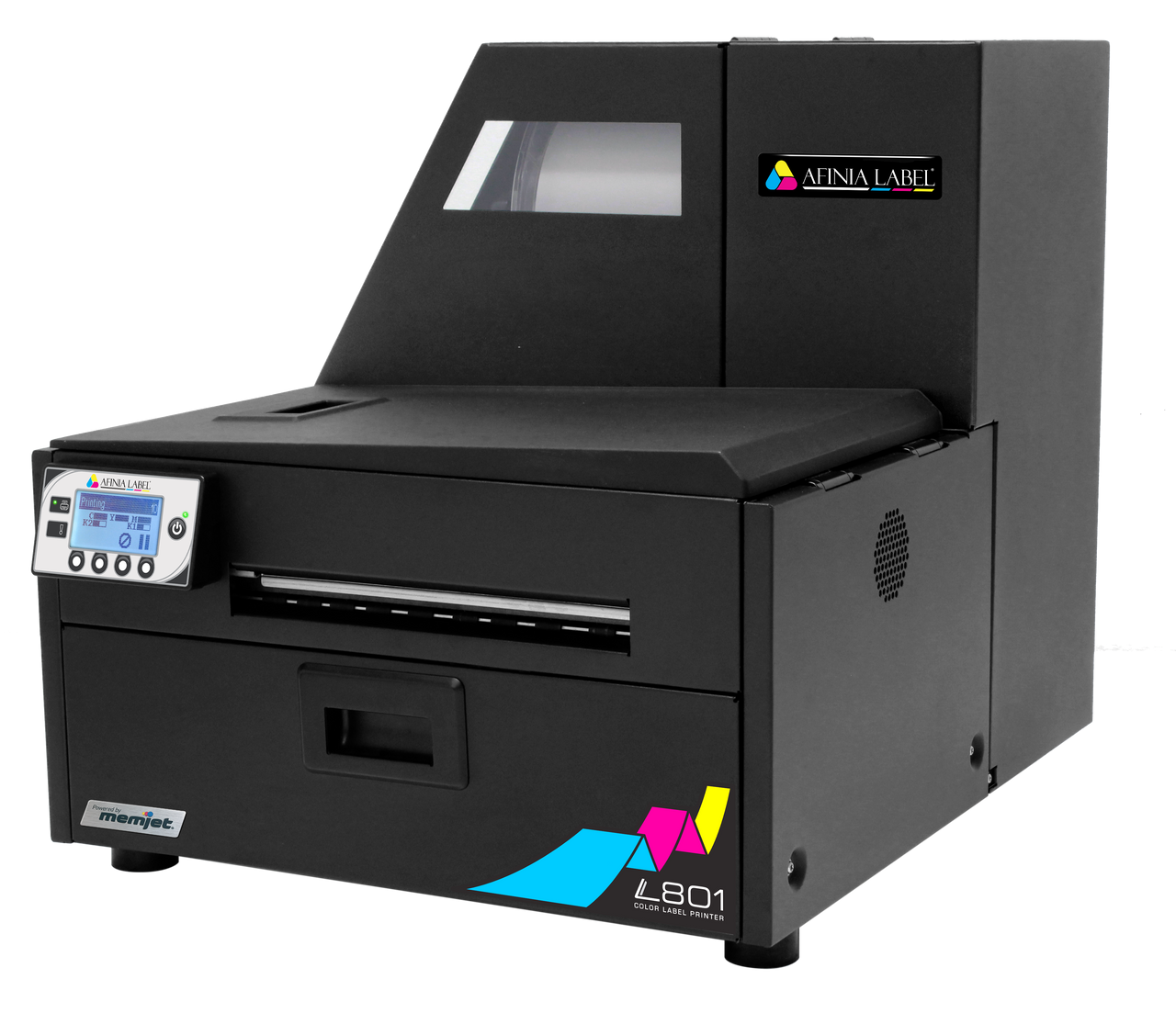
When it comes to implementing color psychology on your labels, the printer you use plays a pivotal role in ensuring that colors are accurately represented and consistent across every batch of products. Investing in high-quality label printers from trusted brands like DuraFast Label Company ensures that the colors on your labels are vibrant, true to design, and maintain their integrity over time.
DuraFast offers a wide range of label printers like the Afinia L801 Color Label Printer and Epson ColorWorks C7500G Label Printer that are specifically designed for high-quality output, including models that specialize in precise color printing for product labels. By using printers that support a wide color gamut and advanced printing technology, businesses can ensure their labels reflect the intended color psychology and appeal to the emotions and behaviors of their target audience. Whether you're printing small batches or large volumes, DuraFast's printers deliver exceptional results, ensuring your labels stand out with the right colors that foster trust and influence consumer behavior.
By choosing a reliable, high-performance label printer from DuraFast, you ensure that the colors used on your product labels are rendered with the highest quality and precision, which is essential for conveying the intended psychological message to your customers.
Maximizing Label Quality with DuraFast's Premium Labels
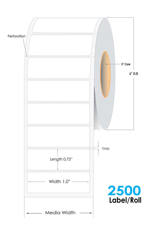
Even the best printer can only do so much if the labels themselves aren’t of high quality. To truly capitalize on the power of color psychology and ensure that your labels create the desired impact, you must choose premium label materials that are durable, professional, and compatible with your printer’s capabilities. DuraFast Label Company offers a range of premium blank inkjet labels, thermal transfer labels, and custom labels that are designed to provide excellent print quality and long-lasting durability.
Whether you are using thermal transfer labels for sale such as the DuraFast Premium Glossy Inkjet Labels or looking to purchase blank inkjet labels online, DuraFast provides options that help prevent issues like smudging, fading, and peeling—common problems that can undermine the effectiveness of your color choices and hurt your brand’s reputation. Their label materials are specially designed to work seamlessly with their printing systems, allowing businesses to achieve consistent, vibrant results that capture attention and foster trust.
By selecting the right combination of high-quality printers and labels from DuraFast Label Company, your business can make the most of color psychology to influence consumer behavior, drive purchases, and build lasting trust with your customers.
Leverage Color Psychology with DuraFast Label Company
Understanding color psychology in label design is a powerful tool that can drive consumer behavior, enhance brand recognition, and ultimately lead to increased sales. By strategically using colors to convey emotions, build trust, and influence purchasing decisions, businesses can position themselves for success in highly competitive markets.
However, achieving the desired psychological effect with your labels depends on more than just choosing the right colors. The quality of your labels and the precision of your printing methods are crucial to ensuring that your designs are accurately reproduced and maintained over time. DuraFast Label Company offers top-of-the-line printers and label materials to help businesses achieve consistent, high-quality results every time.
Whether you're looking to buy ink cartridges for printers, purchase custom thermal transfer labels, or invest in high-quality label printing solutions, DuraFast has a wide range of products designed to help you deliver the perfect color application. Their expert guidance and premium products ensure that your labels are not only visually appealing but also functional and durable.
With the right tools from DuraFast Label Company, you can bring your color psychology strategies to life and create labels that effectively communicate your brand’s message, resonate with your customers, and encourage repeat business. Contact us today to learn more.