
Understanding Color Psychology in Label Design: How to Influence Consumer Behavior
30th May 2025
Colors on your product labels do more than make them look attractive—they shape how consumers perceive your brand, build trust, and drive purchase decisions. By understanding color psychology, you can design labels that connect with your audience and influence their behavior. This guide explains the psychological effects of colors, how they impact perception, trust, and buying decisions, and how to apply these principles across industries like food, cosmetics, and pharmaceuticals.
Psychological Effects of Colors
Colors trigger emotional and psychological responses that affect how consumers view your products. Each color has specific associations, and choosing the right ones for your labels can align your brand with the feelings you want to evoke. Here’s a detailed look at common colors and their effects.
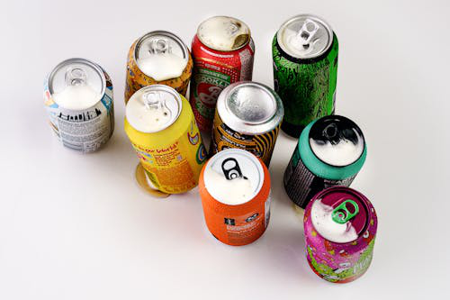
- Red grabs attention and creates a sense of urgency. It’s often associated with energy, excitement, and passion, making it ideal for promoting sales or limited-edition products. If you’re a beverage company, a red label on a new energy drink can signal boldness and encourage impulse buys. However, too much red can feel aggressive, so balance it with neutral colors like white to avoid overwhelming consumers.
- Blue conveys trust, reliability, and calmness. It’s widely used in industries where credibility is key, such as pharmaceuticals or financial products. If you’re labeling a bottle of over-the-counter medication, a blue label can reassure consumers about the product’s safety and quality. Light blue feels approachable, while dark blue suggests authority, so choose shades based on your brand’s tone.
- Green is linked to health, sustainability, and nature. It’s a top choice for organic or eco-friendly products, like natural skincare or plant-based foods. A green label on a vegan snack bar can signal environmental responsibility, appealing to eco-conscious shoppers. Different shades matter—lime green feels fresh and youthful, while forest green suggests maturity and premium quality.
- Yellow evokes optimism and warmth, making it great for grabbing attention without the intensity of red. It works well for products aimed at younger audiences or those promoting fun, like candy or toys. A yellow label on a children’s juice box can create a cheerful, inviting look. Be cautious, as bright yellow can strain the eyes if overused, so pair it with darker colors for contrast.
- Black signals sophistication and luxury. It’s common in high-end products, like premium wines or designer cosmetics. A black label with gold text on a perfume bottle can make it feel exclusive and upscale. However, black can feel heavy, so use it sparingly on smaller labels to maintain readability.
- White represents purity, simplicity, and cleanliness. It’s often used in health and beauty products to suggest safety and minimalism. A white label on a skincare cream can make it feel pure and gentle. White also serves as a neutral background, letting other colors stand out, but it can look plain if not paired with bold accents.
These associations aren’t universal—cultural differences play a role. For example, white symbolizes purity in Western markets but is linked to mourning in some Asian cultures. If you’re selling globally, research your target market’s color perceptions to avoid missteps.
Impact on Consumer Perception
The colors you choose shape how consumers perceive your product’s quality, value, and purpose. A well-chosen color scheme can make your product stand out on shelves and align with your brand’s identity.
For example, if you’re a food company selling organic snacks, green and earthy tones like brown can make your product seem natural and wholesome. This aligns with consumer expectations for healthy foods, making your brand appear authentic. In contrast, using neon colors on the same product could confuse shoppers, as they associate those hues with artificial or sugary items.
Color also affects perceived value. If you’re selling a budget-friendly cleaning product, bright colors like orange or yellow can suggest affordability and energy, appealing to cost-conscious buyers. For a luxury cleaning brand, darker colors like navy or black with metallic accents can make the product feel premium, justifying a higher price point.
Consistency matters, too. If your brand uses blue across its website and packaging, a blue label reinforces recognition. If you suddenly use red for a new product, it might confuse loyal customers. Stick to a cohesive color palette to build a strong, recognizable identity. For instance, a coffee brand known for brown and gold labels should maintain those colors across all products to avoid diluting its image.
Readability is another factor. Colors must contrast well to ensure text and barcodes are legible. A black label with white text is highly readable, while yellow text on a white background is hard to see, especially for small fonts. If you’re printing barcodes, high contrast is essential for scannability. Use label design software, like BarTender, to test color combinations and ensure clarity.
Building Consumer Trust
Trust is critical for convincing consumers to choose your product, and colors play a big role in establishing it. The right colors make your brand seem reliable and professional, while poor choices can raise doubts.
Blue is a top choice for trust-building, especially in industries like pharmaceuticals or baby products, where safety is paramount. A blue label on a bottle of infant formula can reassure parents about its quality. Studies show blue is the most trusted color across cultures, making it a safe bet for global brands. If you’re launching a new health supplement, a blue and white label can signal dependability, encouraging first-time buyers.
Green also builds trust for eco-friendly or health-focused products. If you’re a cosmetics brand emphasizing natural ingredients, a green label can make consumers feel confident about your claims. Pairing green with certifications, like “USDA Organic,” strengthens this trust by providing visual and textual proof of your commitment.
Transparency enhances trust, too. If you’re a food brand, use white or light colors to create a clean, open look, then add clear text about ingredients or sourcing. A white label with black text on a jar of honey can make it feel honest and straightforward, appealing to shoppers who value transparency.
Avoid colors that clash with your product’s purpose. A red label on a calming herbal tea might make it seem energizing instead, confusing consumers and eroding trust. Similarly, using too many colors can look chaotic, suggesting a lack of focus. Stick to two or three complementary colors to project professionalism.
Influencing Purchase Decisions
Colors directly influence whether consumers buy your product by triggering emotional responses that drive action. By aligning colors with your target audience’s preferences, you increase the likelihood of sales.
Red is effective for impulse purchases. If you’re a snack brand, a red label on a bag of chips can create urgency, prompting shoppers to grab it off the shelf. This works well in retail settings like convenience stores, where quick decisions are common. Pair red with promotional text, like “Limited Time Offer,” to amplify its effect.
Yellow and orange draw attention and encourage purchases for fun, affordable products. If you’re selling a new soda, an orange label can make it feel refreshing and approachable, appealing to younger buyers. These colors work best for low-cost items, as they signal value without seeming cheap.
For premium products, black, gold, or deep blue can drive purchases by suggesting exclusivity. A black label with gold accents on a bottle of craft whiskey can make it feel special, encouraging consumers to spend more. These colors work well in industries like wine, cosmetics, or electronics, where perceived value drives sales.
Demographics matter too. If you’re targeting older consumers, use calming colors like blue or green to create a sense of reliability. For younger audiences, vibrant colors like pink or teal can feel trendy and exciting. If you’re a toy company, a multicolored label with yellow and red can attract kids and their parents.
Seasonal colors also influence buying. During holidays, red and green labels can tie your product to festive themes, boosting sales. A red and green label on a holiday-themed cookie tin can make it feel like a must-have gift. For summer products, blue and yellow can evoke beach or sunshine vibes, making your product more appealing.

Applying Color Psychology Across Industries
Different industries have unique needs, and your color choices should reflect these. Here’s how to apply color psychology effectively in key sectors.
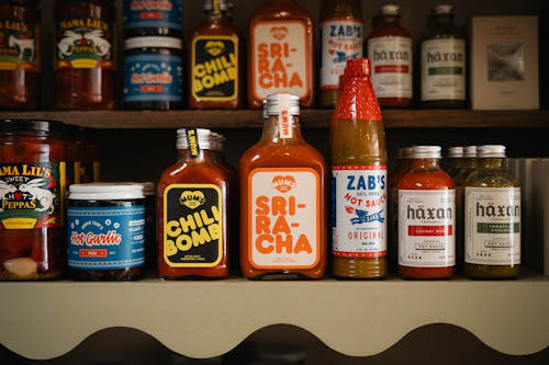
Food and Beverage: Use green for healthy or organic products, like salads or smoothies, to signal freshness. Red and yellow work for snacks or fast food, encouraging quick purchases. If you’re labeling a premium coffee, brown or black can suggest rich flavor and quality. Ensure colors contrast with text for readability, especially for nutrition facts. High-quality color label printers for sale, like the Epson ColorWorks C6000, produce vibrant food labels that stay legible in refrigeration.
Cosmetics: Black, white, or pastel colors like pink convey luxury or gentleness. For a high-end lipstick, a black label with gold text feels sophisticated. For natural skincare, green or white suggests purity. Use blank inkjet labels for sale to print detailed designs that highlight ingredients or benefits. Test colors on your packaging to ensure they match the product’s aesthetic.
Pharmaceuticals: Blue and white are standard for trust and safety. A blue label on a pain reliever makes it feel reliable, while white ensures clarity for dosage instructions. Use thermal transfer labels for sale with pigment-based inks to prevent fading during long-term storage. Regulatory compliance is key, so ensure colors don’t obscure mandatory text or barcodes.
Retail and E-commerce: Bright colors like red or orange grab attention for budget-friendly products, while black or gold suits premium items. For e-commerce, durable labels are essential for shipping. Custom thermal transfer labels work well, as they resist smudging and peeling. Include QR codes in contrasting colors to engage customers with promotions or product details.
Practical Tips for Label Design
To make the most of color psychology, follow these practical steps. First, research your target audience’s preferences and cultural associations to choose effective colors. If you’re selling in multiple markets, adapt colors to local expectations. Second, use label design software, like NiceLabel, to create and test color schemes. You can buy barcode printing software online to ensure accurate color rendering and scannable barcodes.
Third, balance aesthetics with functionality. Choose colors that enhance your brand but maintain high contrast for readability. For example, pair a green background with black text for a natural look that’s easy to read. Fourth, test your labels in real-world conditions—check how colors hold up under lighting, moisture, or handling. Finally, work with high-quality printers to achieve consistent results. Inkjet printers with pigment inks, like the Primera LX910, are ideal for vibrant, durable labels.
Use Color to Drive Success
Colors in label design are powerful tools for shaping consumer perception, building trust, and influencing purchases. By understanding the psychological effects of colors and applying them strategically across industries, you create labels that connect with your audience and boost sales. To bring your designs to life, purchase color label printers online, buy blank inkjet labels online for vibrant prints, and invest in the best label design software for printers. For durable options, check out thermal transfer labels for sale at DuraFast Label Company to ensure your labels make a lasting impact.